
NORWEGIAN AQUA
Global Brand Strategy + Positioning


Role & Expertise: Creative Strategy · Creative Direction · Team Leadership · Art Direction
THE OPPORTUNITY.
With Norwegian Aqua, the opportunity wasn't simply introducing a new ship—it was defining what made this experience distinct in an increasingly competitive cruise market, all while distinguishing the ship from the rest of the class.
THE STRATEGY.
We identified an opportunity to position Norwegian Aqua around the new features available to the ship class, leaning into the audience's desire for something new. This became the foundation for how we approached the brand story, messaging, and visual identity across the launch.
THE CREATIVE.
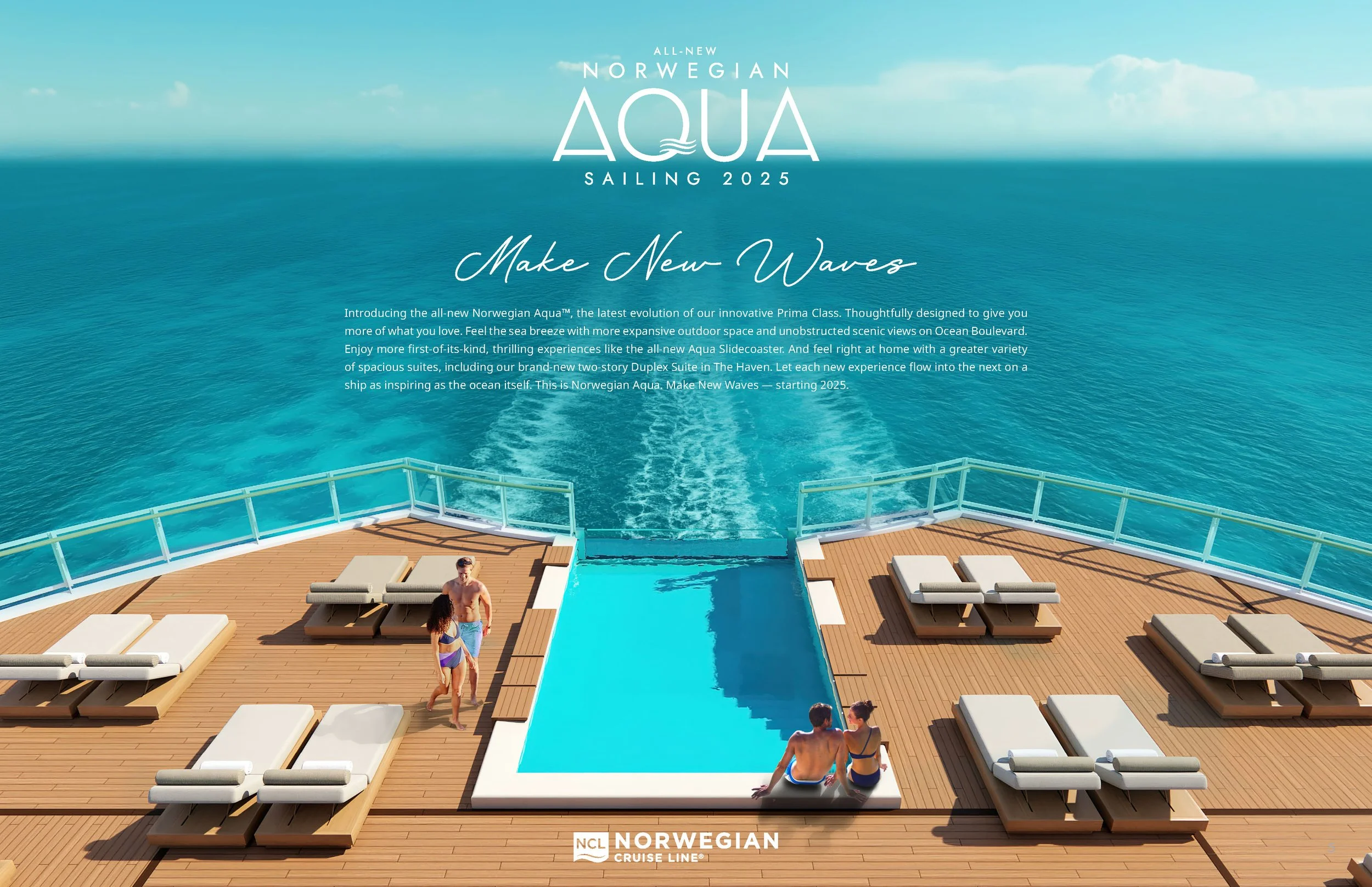
From the campaign platform to photography, film, digital, and onboard storytelling, the creative system was designed to make that positioning tangible at every touchpoint. The tagline, Make New Waves, is the embodiment of the creative by tying in the strategy to the ship name; celebrating innovation, energy, and the thrill of discovering something new on the open ocean.

Our team built a color story that transformed every image, editing the ocean itself into striking shades of aqua. We shifted the visual perspective too, using sweeping top-down renders instead of traditional eye-level views to emphasize scale, freedom, and the endless horizon.
The branding was also thoughtfully designed, pulling from a subtle brand “Easter egg”. The waves inside the “Q” were lifted from NCL’s signature tilde, the curve at the base of the logo shield. To mark her place as the third ship in the Prima class, we wove in three tildes, a clever nod that tied heritage and innovation together in one mark.
MY ROLE.
I helped shape the creative strategy and led the creative development across campaign development, visual production, video, digital, and social. Working across internal teams and external partners, I guided the work from strategic development through execution.